I have recently be analysing different Genre's of magazine, and the difference between a fashion and a music magazine are completely different, as a music magazine is the main article in this study, I will compare different magazine types to it, for example, fishing magazines, fashion magazines, childrens magazines, hair magazines etc are all different. I will be analysing magazines Kerrang! and Bliss.
Kerrang! Introduction
Kerrang is a rock music magazine published by Bauer Consumer Media in the UK, retailing at £3.20. The name "Kerrang!" is an onomatopeoia, because it refers to the sound made when playing a power chord on an electric guitar, this gives the whole magazine it's genre, just by the title we already know that it is supposed to be related to electric guitars, which I associate with rock music. The first magazine was published on 7th June 1981 and was initially a one-time supplement in the "Sounds" newspaper which was focused on the genre New Wave Of British Heavy Metal and the rise of other hard rock acts. AC/DC appeared on Kerrang!'s first cover, United Newspapers sold it to EMAP in 1991.
Content
Kerrang! magazine is typically around 48 pages long and is mainly focused on the progression of rock and metal music, this includes old bands doing new things and even introduces up coming bands. Alot of the content is built up of interviews of bands, posters and gigs, there is very little space for advertising throughout the magazine compared to glossy magazines. The opening page is the contents page. The contents page consists of this:
-Page numbers down right hand side.
-Band pictures with page number of where this image is found and small text.
-Page headings.
-Main image, usually someone on the front cover.
-Funny quote from a band at top of magazine.
-Letter from editor at top of magazine to make it seem more personal to reader.

A typical double page spread in Kerrang! would be a band interview, usually a double page spread will be linked with the front cover band, this band will be famous, not new or a promo, this is the first thing people see and if they like it they will buy it, if they don't know who the band are, why waste money? they might not enjoy it! The DPS contains a main image, this is usually a large image which takes up most of one side, the other side is the interview. The header to the DPS is usually something funny or eye catching in a "Oh my days really!?" kind of you have to read on else you'll never know how (insert famous rockstar name here) got 7 people pregnant in one night on tour.
Audience
Kerrang! magazine is aimed at rockers and other stereotyped people who enjoy rock music, in all fairness, this is a very stereotypical magazine, you wouldn't expect to see a 24 year old business woman with bleech blonde hair and pink lipstick pick up the latest Kerrang! cause Bring Me The Horizon are featured in a poster and she has the hots for Oli Sykes. The plain colour sceme of contrast colours such as black and white isn't meant for girly types, it's meant for Goth's and Emo's and Punk's who, stereotypically, like dark colours. However, this also seems pretty boring, which suggests it is for an older audience, and it may be, but i know people as young as 13 who buy Kerrang! every wednesday, I also know people as old as 40 who buy it, therefore my conclusion is that it doesn't have a target age but a target stereotype.
Bliss introduction
Bliss is a mainly British magazine which retails at £2.50 and often comes with a gift such as beauty products. The cover is often a female celebrity, like a singer or actress, but isn't always majorly famous, alot of new upcoming stars are featured on the front cover, this can be argued that the magazine is usually bought just for the free gift which comes with that issue. I remember buying this magazine when I was younger (it was £2.30 then) mainly for the gifts, between Bliss and Sugar it was always a contest of the best gift because that is what appeals to young, teenage girls.
Content
Contains around 104 pages on average, the content in this magazine doesn't really have a main point, whereas Kerrang! is mainly for the interview within. Bliss contains subjects like celeb gossip, latest fashion, hair and make-up looks, problem pages, puberty, sex, boys, friends and an interview with the cover girl. There is alot of advertising in this magazine, not always as an actual advertisement but pages advertise contests, fashion advice pages include where garments are worn so it is like a promo for them, but it is still very different to a more adult glossy magazine which would have advertisements for beauty products, toothbrushes, cars and food, as adults are able to buy this stuff and have interest for more every-day items rather than sandals that won't last 3 hours.
A double page spread is usually a real life story or interview with the cover girl or a "hot" band, I put this in quotes because the band featured in this double page spread is the Jonas Brothers...my case is closed. The layout of the double page spread is similar to the one in Kerrang!, this is because there is a main image on one side and the majority of the interview is on the other side, however, several different pictures are used over the other page too so the interview is possibly not as long as one featured in kerrang! magazine. The header is in the middle of the first page in bold text, it isn't a quote but something about the band or person, in this case, they are brothers, so they have put "Brother Love" as the header, original.

Audience
The target audience for Bliss magazine is teenage girls, varying between probably 12-16, although I read a few problem page people as 17 or 18, but I wouldn't buy this magazine now and I'm 18...in 2 days. It doesn't appeal to me anymore, it's very candy pop girly type, and although alot of the time they talk about sex and boys, I think it may be more to make the younger teenagers feel more adult and grown up reading articles like these. Alot of the stars also seem to be on the Disney channel or famous singers like Beyonce or Christina, because they are modern and have songs int he charts, which will be what younger teenagers hear.


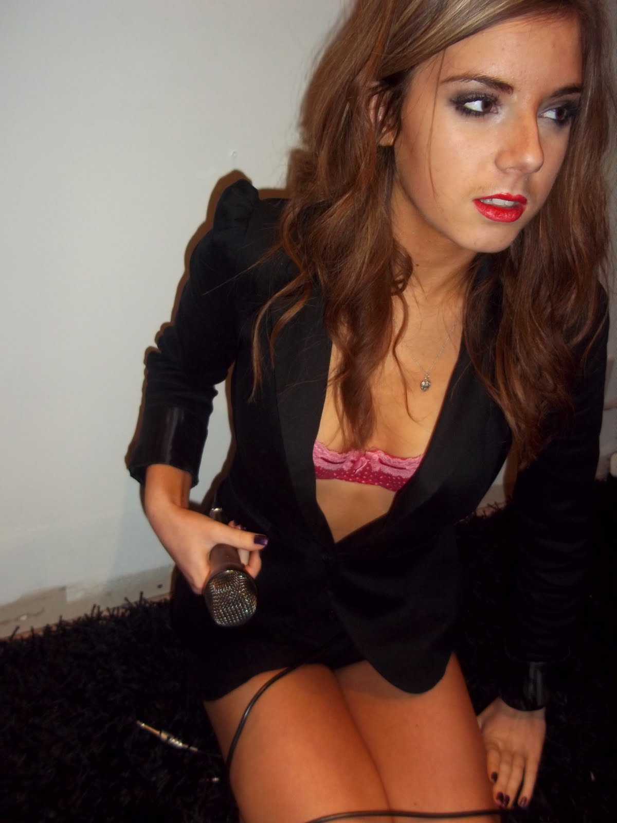


 So I did a photoshoot with a fellow media student to get my photos for my music magazine, fortunately, she's a Cheryl Cole double, so my whole magazine shall be based around this. I didn't take 10000 photos because my camera just couldn't handle it, I got a new one shortly after this photoshoot, it's just as rubbish.


